SEO Arcade SaaS Feature:Charts & Graphs Tab

We’re happy to announce that we’ve added multiple new visualizations of our data to help you understand and present the data we’ve gathered in our SEO forecasts. We hope these line charts help you present your finding and communicate ROI to your boss or client.
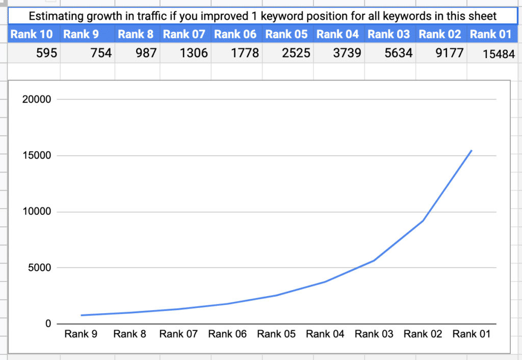
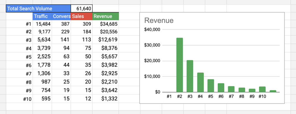
We’ve gathered relevant keywords by looking at who is currently ranking for your target keyword. This is a visualization of your SEO forecast data, showing how your potential traffic if you ranked for all those keywords in different positions.
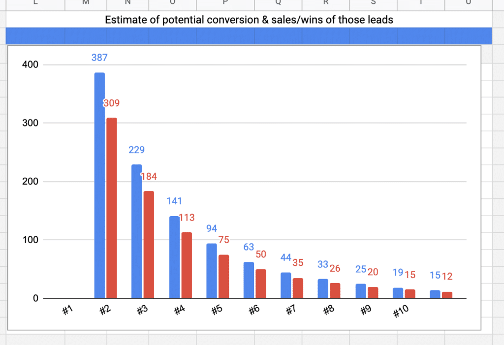
This chart visualizes how many “conversions” and sales your could win if your site ranked for that entire set of relevant keywords in that specific position.
This visual shows the overall total monthly volume of traffic, how much traffic, conversions, sales and revenue are in this particular “keyword marketplace”.
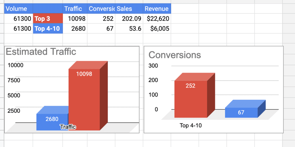
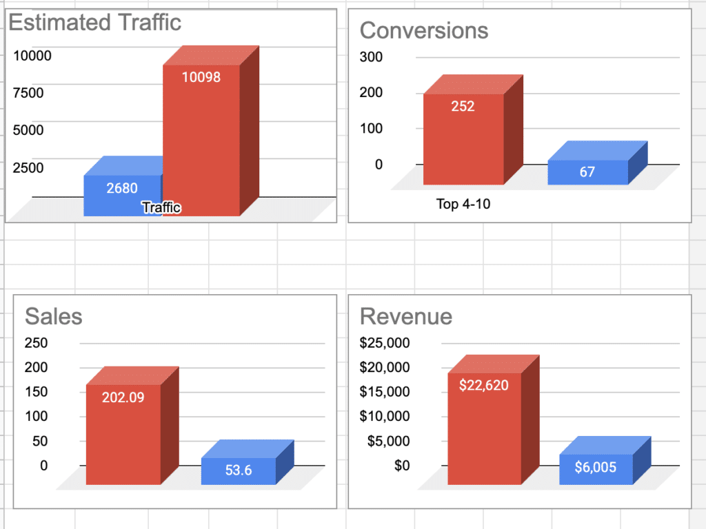
It’s not really realistic to think you will be #1 for ALL keywords. These visuals show you the difference in traffic and conversions based on estimations of that relevant keyword set if your ranked for those terms in the Top 3 positions of Google on average, vs in the bottom 4-10 positions.
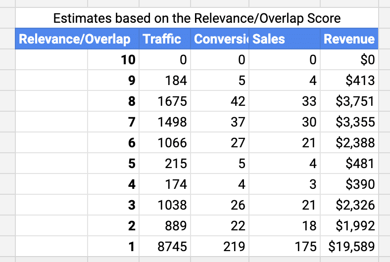
We look at the top 10 urls currently ranking for your target phrase. By adding a number of how many of those URLS co-rank for the SAME term, you can get an idea of how relevant Google finds those keywords. By then examining how much traffic, conversions and revenue are available by these relevance scores you can see if there are OTHER keywords to explore that might have higher amounts of opportunity. See here, just 1 URL ranks for the most valuable keywords.

Leave a Comment

Your email address will not be published. Required fields are marked *

Scroll to Top